Background:
Amazon Prime Video is a streaming service that offers subscribers access to a variety of TV shows and movies. Other competing services include Netflix, Hulu, HBO, just to a name a few.
The majority of content is produced by other studios, however, Amazon has recently been investing in the production of original content such as, The Grand Tour, The Man In The High Castle and many more in order to attract more subscribers and compete against the other streaming services.
Amazon does not currently have an Amazon Prime Video app on Apple TV despite having an iOS app. This is most likely due to their own competing platform – Amazon Fire TV (which works in a similar way to Apple TV). They do however, have an Amazon shopping app on Apple TV.
Initial Thoughts:
Referring to the tvOS design guidelines, it was evident that the experience should:
- Provide enough clarity
- Work well with the Siri remote
- Consider the distance between users and the screen.
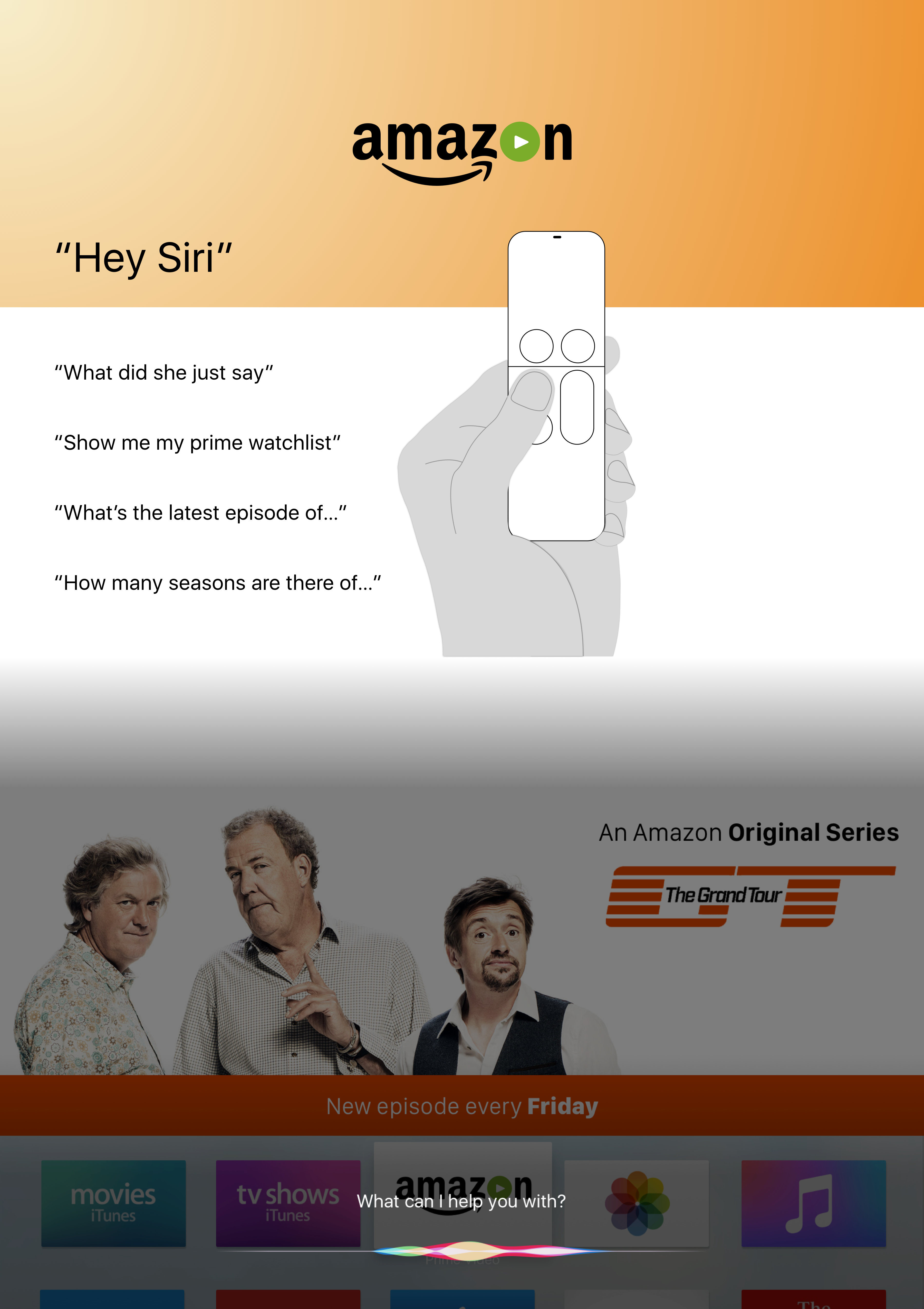
The last point was important because unlike on iOS devices where users are looking at their devices, tvOS requires the support of the Siri Remote to navigate around the interface. This is through a combination of gestures and controls: tap, click, swipe and of course the use of Siri.
When looking at current streaming services, what is it that sets them apart aside from content? It is the user experience. Unpicking Amazon’s video streaming service further, two things stood out:
- Marketing and cross-platform promotion of original and exclusive content
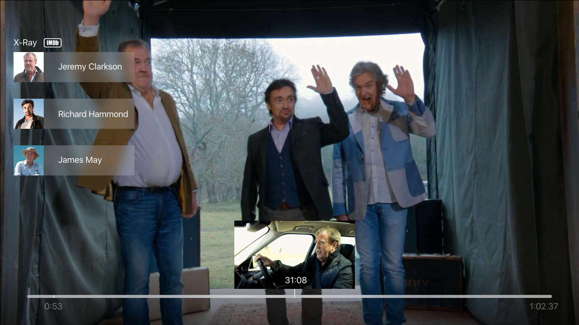
- Intuitive user interface features (rewinding or forwarding by 10 seconds and their X-ray feature that works with IMDb to provide more information about the actors currently onscreen).
Integration of these aspects seemed essential to include into the Apple TV app.
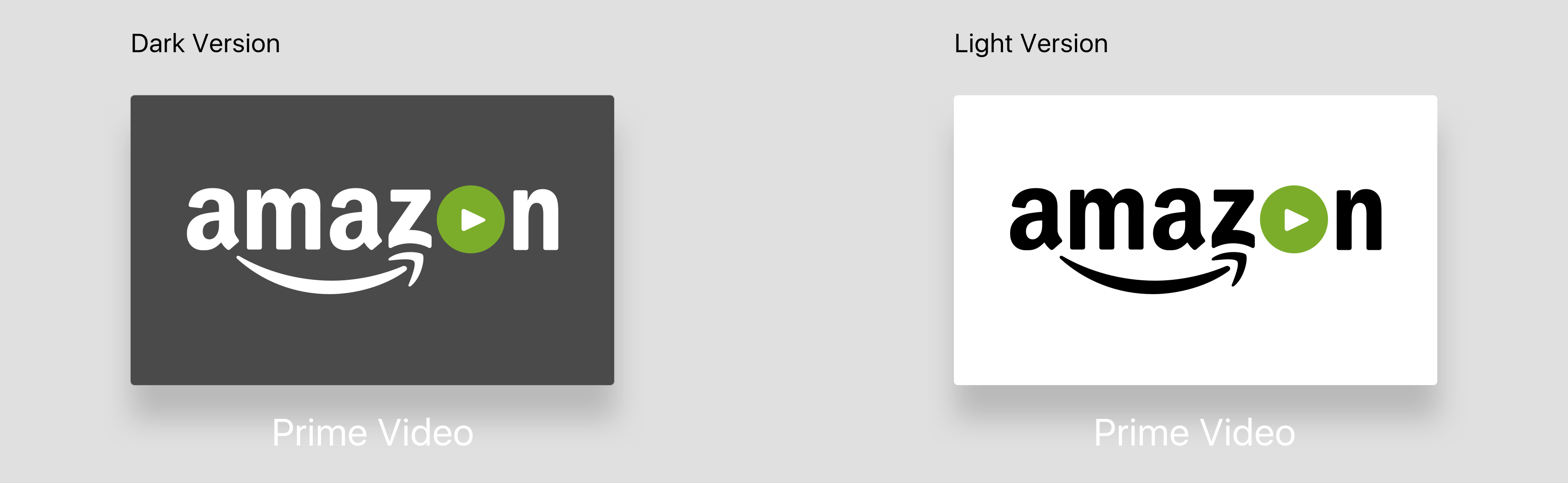
App Icon:
“You don’t get a second chance to make a first impression.” – Oscar Wilde/Will Rogers.
The app icon is the gateway into Amazon’s collection of curated content, therefore, the visual elements needed to convey what the app is all about. Apart from providing a sense of familiarity with existing users, it also needed to provide clarity for new users.
Various versions were mocked up. The lighter version was chosen because it was consistent with other icons available on iOS:
App Store Banner:
Curated content is often featured as banners in the App Store. Having some of Amazon’s most popular original content featured in the banner would provide users with a teaser of what they could expect to watch.
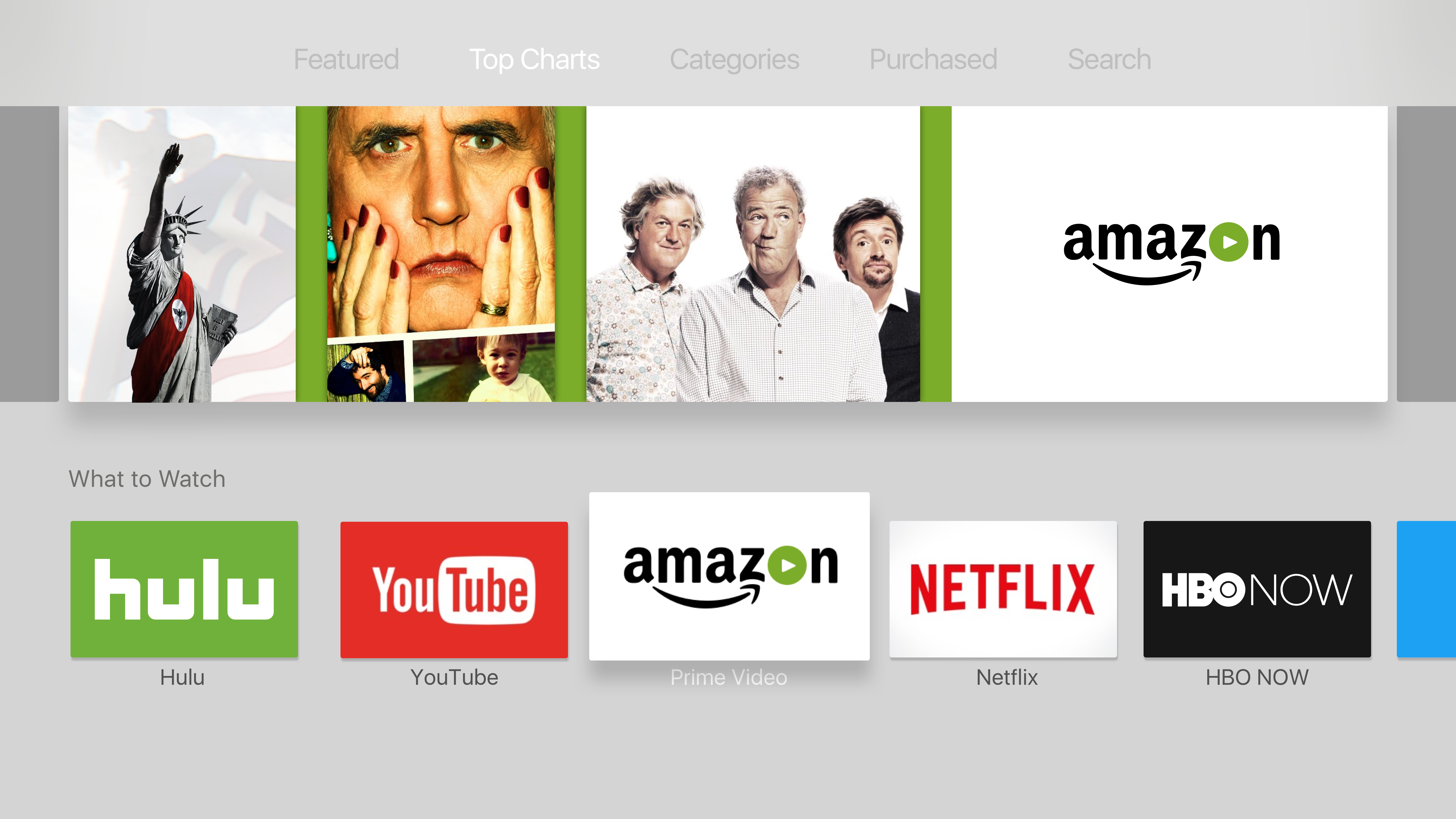
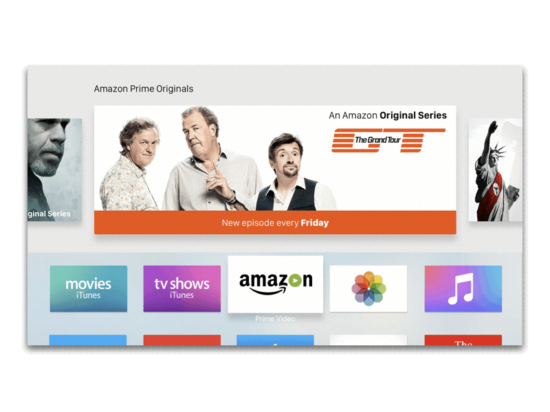
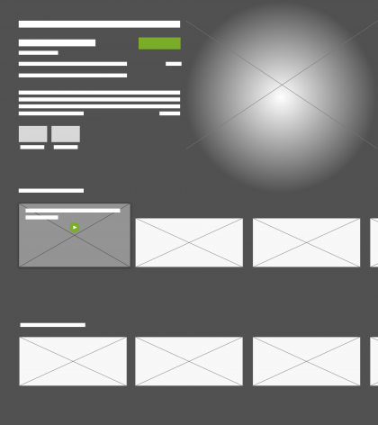
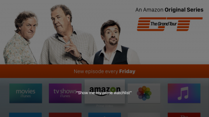
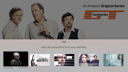
Top Shelf:
In tvOS, users have the option of adding or removing apps from the top row (see diagram below). When an app is selected, featured content is shown in the top shelf.

As can be seen in the wireframes below, there were several versions designed which displayed featured content in the top shelf. A decision was made to focus on original content/exclusives to be featured in the top shelf because this would act as another source of marketing original content that Amazon has invested in.
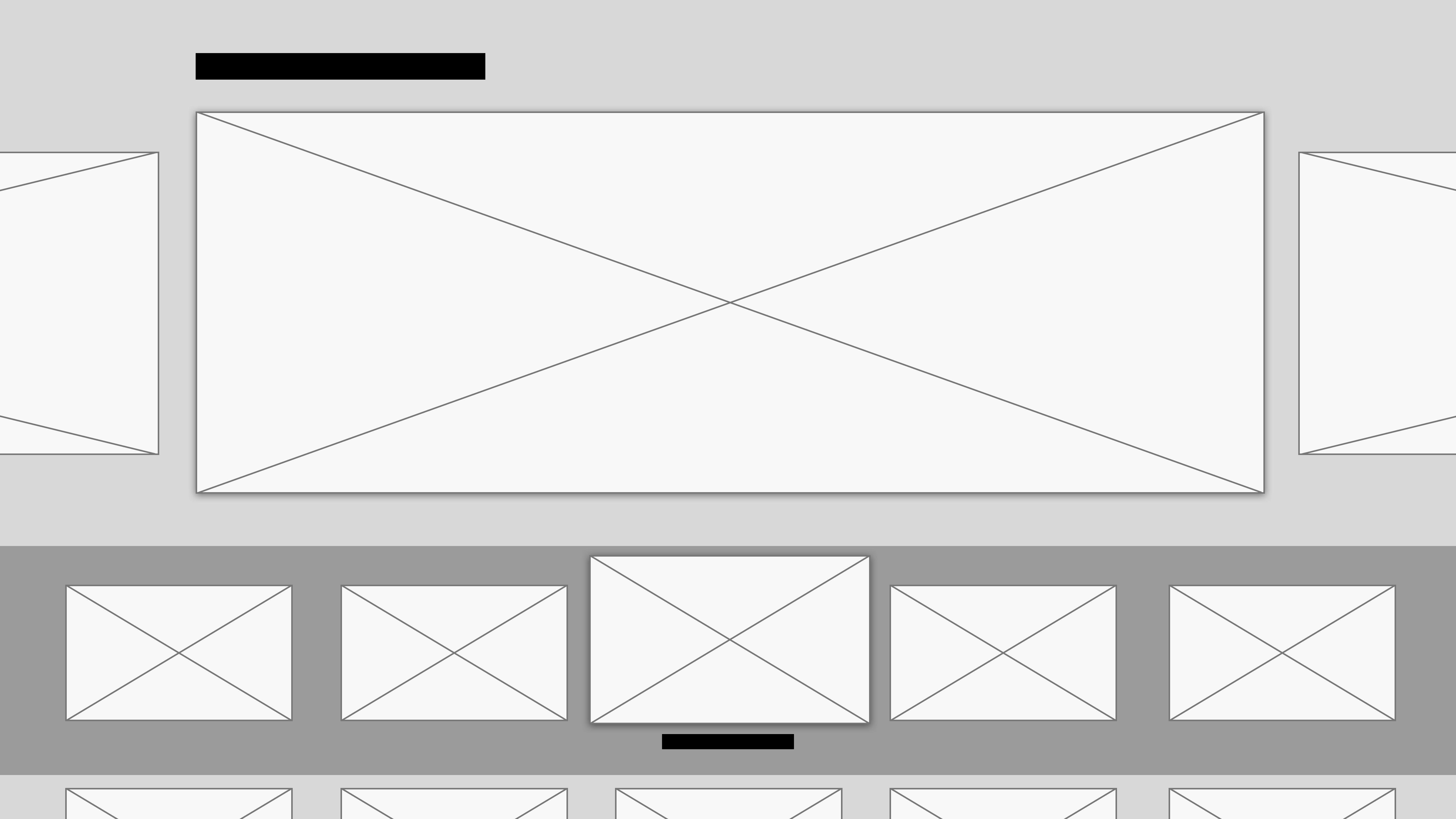
During the ideation process, considerations were made to add the watchlist to the top shelf. A decision was made against this due to the intended purpose of the top shelf showing featured content.
A quick animated prototype was put together to communicate the idea (as can be seen below).
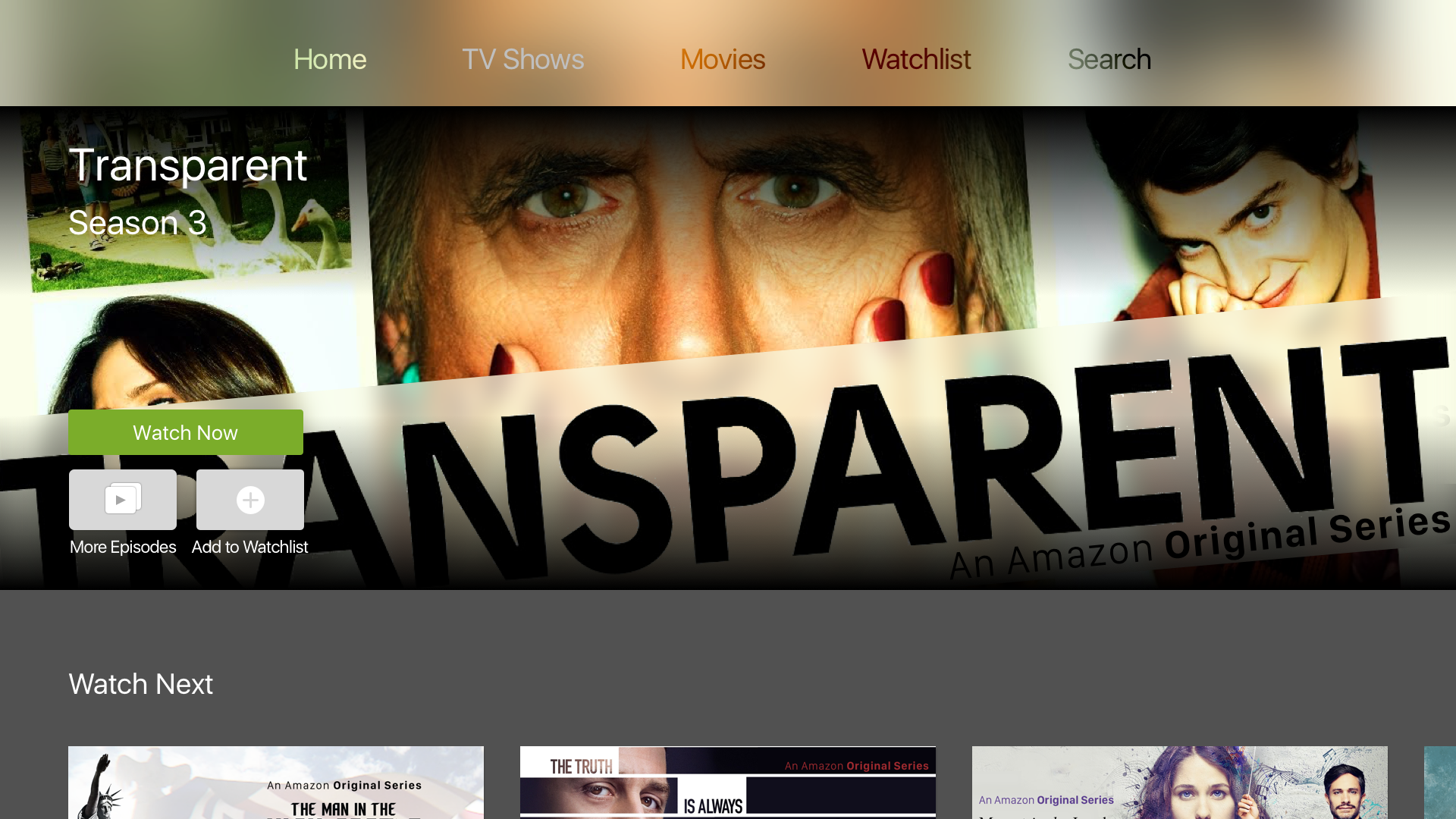
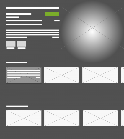
Home Screen:
With a mixture of TV shows and movies, different genres, originals, exclusives and watchlists – how do you organise them?
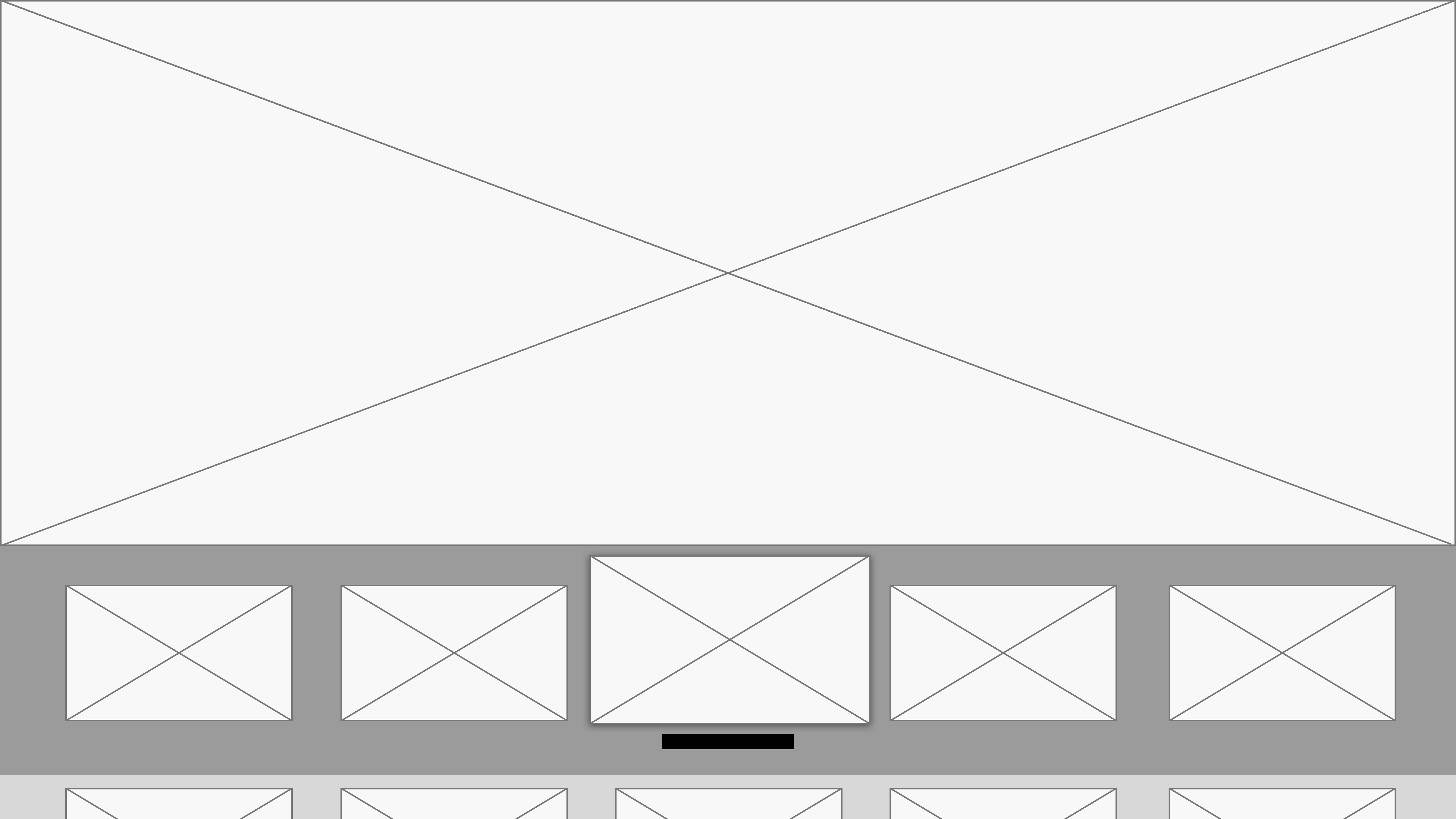
The wireframes below were constructed to help organise some of this information and how this would be displayed to users.


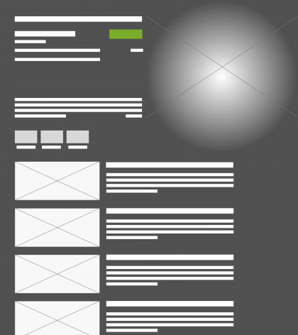
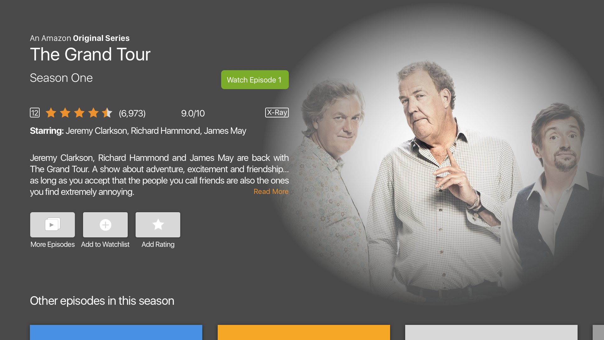
Content Screen:
The challenge here was providing users with the most important bits of information.
When creating wireframes, I played around with different layouts and uncovered issues such as:
- Colour choice – white was clean but was not as immersive as black or grey
- Long titles interfered with button layout.


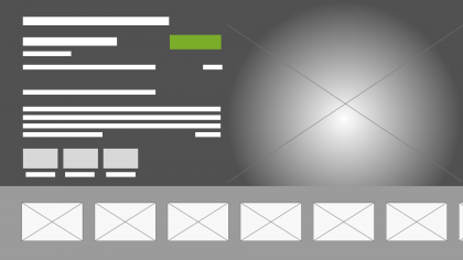


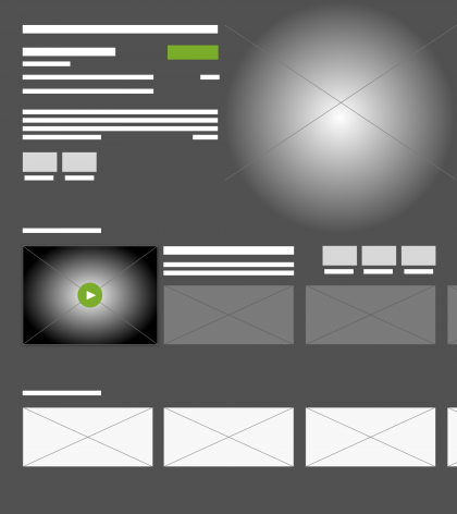
Player Screen:
The main design decisions were centred around what controls or additional information should be shown. This is where I reflected back to what intuitive user interface features Amazon has already released such as, the X-ray feature. This was included into the design when users pause what they were watching.
Connected. Integration with Siri Remote.
Final Thoughts:
It was an interesting design exercise because whilst I have a third generation Apple TV (bought a month before the latest version was released – yes I am mad), the newer fourth generation has a completely redesigned interface. It is this redesign and the inclusion of more third-party apps that has allowed me to complete this side project.
There were a number of design principles taken into consideration which I mentioned earlier in this post. It is important to remember that if you decide to design an Apple TV app, you are most likely designing for the largest screen in a home. Think about other environments that an Apple TV can be used in outside of the home – for example: in a classroom to aid teaching. It is therefore essential that design assets and text are legible and an immersive experience either individual or shared, is maintained.
Taking the concept further:
- Featured content in the top shelf could come to life when a user interacts with it. This could be in the form of showing a selection of still images or even having additional controls such as, playing a trailer.